Thursday, June 23, 2011

Hanging Lake Trail, Glenwood springs


Today we headed to Grand Junction for the put -in to the Gunnison River Canoe Trip. Debbie and I decided to take a break and do the Hike up to Hanging Lake. I had done this 10 years ago but forgot how steep and rocky this was. Even though the mileage was only 1.2 miles each way, this was classified as a challenging hike. The lake was gorgeous due to the high waters this summer. Hiking up the trail the smells of the green forest evergreen was heaven. We encountered ferns and beautiful wildflowers of many colors. The views as we peered up into the sky were of the sides of the canyon . As we hiked up the boulder covered trail we saw we were getting nearer to our goal. We passed 6 crossover bridges of switchbacks to get to the top. Views of the descending waterfall kept rewarding our ears with the sounds of the fast rushing water. The altitude climb of 1000 ft was apparent as we needed to stop and rest every once in a while. When we got to the lake was it so worth it. The water was so blue and green and the three waterfalls looked like a fairyland. We walked around the perimeter of the lake and could go up to the falls and feel the refreshing mist of the water. There were many teenagers having a great time taking pics of each other climbing up on the rocks as far as they could. Coming down was faster but we were still cautious so we could continue on our adventure tomorrow on the Gunnison river....

Saturday, June 11, 2011

Acrylic Painting for my Bedroom?


I just recently renovated my master bath and needed some new visual elements for my walls. I got the idea of doing two large panels 24 x 36 overtop my dresser. I used the duvet cover as inspiration for my colors. I chose the pattern (and sea blue for the walls) to feel soothing.
I started working on my double panels. Here are some new techniques I experimented with.
My favorite one was the pouring paint in layers. I started with some Lumiere gold paint and mixed with water to dilute it in a paper cup. Then I squeezed the cup to make a spout and poured. The first time it was too thick and I had to add more water. Then I put several more colors on top. Lastly I did a thin line with titan buff and let it touch the other shape. What I really liked was the organic shapes I made with the pouring.
I also collaged some lacy paper on the canvas over the blue color. If a color didnt work I painted over it. When I was finished I liked the painting but didnt think it was a very restful painting. I hung it in my loft for now. Im still working on my other canvas and Im keeping it more subdued with beiges and lighter colors. Ill keep you posted...


Wednesday, March 9, 2011

Garden Home Show Artistic Creations

I was amazed at the designs I saw at the Denver Garden and Home show. They used different parts of plant to make such unusual creations. The colors and shapes are inspiration for future pieces of art and collage. Some of the plants I didnt even know what they were. I wish they had listed the materials used on their display.


Sunday, February 13, 2011

Canvas, Corkscrews and Collage

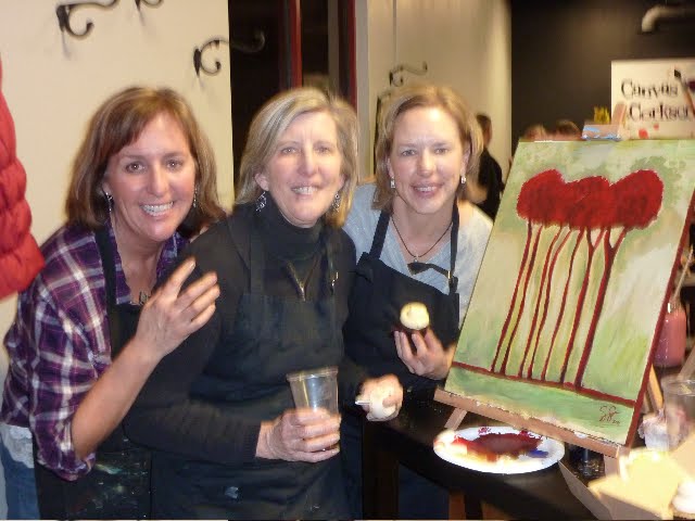
We celebrated Stacey's birthday at Canvas and Corkscrews friday night. I was hesitant to go since I felt everyones looked the same. The night before I gathered paper, images , gel medium and extra paint to bring along. I added the collage element to mine and it turned out to be a fun night.


This is my finished piece. I layered magazine pages, hand painted paper, tissue paper, and mulberry paper before I added the tree. I covered with gel medium and then painted over with the greens, blues , and beige. I rubbed off some of the paint to let the patterned paper show through. Lastly, I painted the trees on and collaged some leaves on top . I added some burlap and a cut out paper fence.


Here is the demonstrated piece. It was interesting how they used negative space to paint the tree. First the red was painted, then the background, lastly , other colors were added to the sky.

Tuesday, February 1, 2011

Snowshoeing Rocky Mountain National Park

What Ive been up to is snowshoeing in our beautiful state of colorado. Im learning the ins and outs of equipment and clothing to wear. After test driving a pair of borrowed snowshoes, I bought some from craigslist. I already had some hiking poles I could use. Now Im trying to get the layering thing figured out. Wind shell, vest , polarfleece, wool shirt. two pairs of gloves.

Last Weekend we had 5 carpools of 26 people meet at Rocky Mountain National Park. We drove to the Bear Lake Trail Head and took the Emerald Lake Hike. It was about 4 miles. We passed by 3 lakes and walked right over them. There was a photographer getting some close up frozen lake shots with his tripod. Afterwards, we headed over to Oskar Blues an artsy pub in Lyons.
It was a fun day.

I think the scenery in the park may be better in winter than in the summer. The snow and rocks on the mountains proved to be one photo opportunity after another.

Wednesday, November 10, 2010

My Art Quilt Layout

After making our fabric designs and practicing stitching, now we had to put together our own art quilts. We had to make sure our piece was balanced and colors blended well together. Here are two designs I came up with. We are using wonder under to adhere the pieces and also stitching some areas together.

Tuesday, November 9, 2010

Free Motion Stitching

For this Week in our Fiber Class it was time to get out the sewing Machine. We practiced something called Free Motion Stitching. You use a special foot (see Below) that allows you to glide over your fabric without rotating the material. You have to disengage the teeth under the foot so it doesnt grab and move the fabric you are stitching. Here are some different shapes we practiced. We also stitched over a piece of fiber yarn. It was fun to do once I got the hang of it.
We used a sandwich to practice our stitches on. There was two pieces of muslin with a layer of batting. We used very thin batting made of wool. Not the cheap polyfil type. To hold the layers together we used a spray adhesive from a can. Our teacher, Jo , prefers to use safety pins.
We had a sub teacher today that was awesome, Susan. Her quilts she showed us were beautiful. Next week we start piecing our own art quilt together.

Sunday, October 31, 2010

Batik on Fabric

In our next class we created fabric using the batik dyeing. We used two kinds of wax. Soy wax can be washed out but beeswax must be ironed out of the fabric between newspapers. Hopefully I can use some of my finished fabrics in my art quilt. Jo showed us how to do the dye baths to get such vibrant color. Next week we practice free motion stitching.

We used brushes and tools to apply the wax before we dyed. You could make thin or thick lines -even shapes. Then we put our fabrics in the dye baths. Wherever the wax was painted or applied, the fabric stayed white. The wax acted as a resist.

Thursday, September 30, 2010

Marbling in my Fiber art class

Im taking another class at the Denver Art League. This time I signed up for a Fiber art quilt collage. Today we did marbling with some fabric pieces. We used acrylic paint with a pipette dropper. I couldnt believe how vivid the colors were. Our class is very small only four peeps!.
We tried various types of fabrics to see the effects. I even used felt. We will use one or two designs in our final piece. This will give us some inspiration. Our homework this week was to look for some design ideas. We will be doing some other techniques next week.
This is the pan before we pulled a design on the fabric. It was so Much fun!

Sunday, August 15, 2010

Color Theory Class- Monochromatic color mixing

For this assignment, we had to create a drawing on small size paper (5 x 8) four times and then paint them four different ways. I chose to draw from a photograph I took in Seattle of calders sculpture with the seattle needle peeking through.
One painting used all 12 values of the color and the other paintings used only half the values.
See if you can guess which painting was the darker shades, which was the lightest tints and which painting used the values in the middle. We discussed how each painting gave a different mood and which painting we liked the best.

Making a Book Club Journal

This was a journal I made for my mom's bday. It was covered with paper that I silkscreened onto heavy art paper. The stitch I used was a coptic binding. I photocopied pages that had lines for authors name, book, and comments. My mom belongs to several book clubs and I have one and it is handy to remember all the books Ive read.
Below is the inside spread that I used stickers to spell Book club record.

Sunday, July 4, 2010

Values Charts and More Color

This was our next project in my color theory class. The scan did not come out too dark but we had to take a few colors and mix white with them to get the tints. Jane had a technique she taught us that you started with the dark color first and added the white to it. This was different than I teach mixing colors. Next we mixed all our colors on the mixing paper side by side at once and then added or took away some of the mixed colors until we had 9 that were distinctively different. Sometimes the colors I mixed jumped too far to the darker color and I had to remix with more white. The second black chart was better the second time.

Sunday, June 27, 2010

My Color Chart

This was our first assignment in my Color Theory Class. This took lots of time to mix each color with each other. I used 23 different colors and listed them along the top and the side. We had to mix them equally (or try to) and paint the result in the square in the middle. It was interesting all the different colors you can get from 23 colors. There were many different shades of green and brown and orange. I am still not finished . I cropped it to look full. We are supposed to complete it by the end of the class.

Thursday, June 3, 2010

My Color Theory class at the Denver Student Art League


Tues night Kim and I started our new art class taught by Janie Jones. The first night we didnt get to use our paints (above) We had to bring only primaries which included cool and warm colors of each one.
The entire class was lecture and I learned alot I didnt know about color and how you choose colors in your painting. Here are some tips that I remembered:
Color is very emotional, Yellow and red are used for fast food signs and ads. Red makes you hungry and yellow makes you leave, sit down restaurants use blue and green in their decor for relaxing and staying there to eat.

Colors are perceived differently depending on what other colors are around them. So a color can be bright, intense, dull if compared to something that is less.

Dark colors are hard to tell what they look like, by adding white to it, you can see the color clearly.

There are different color harmonies you can use in your painting . i.e. analagous, complementary,triads. A good way to decide what colors to use in your painting is to start with a limited few colors to give the backbone for your color, then add other colors . Use a limited pallette gives unity to your painting.

Complementary colors give contrast and more intense color. This is excited by the eye.

Adding Black to a color can make it dead looking. There are different types of blacks like mars black, ivory black and lamp black. They all look different so experiment.

When you add white, you dull the color.

We learned that on the back of the pain tubes a code tells if your color is transparent, opaque, semi-transparent.
We were given an assignment to make a giant color chart from mat board. This should be helpful when mixing colors.

Wednesday, May 26, 2010

Notecards from my Collage

I Wanted to make some thank yous for all my great Volunteer parents in my art class. I found a collage page in my altered book and scanned it. Then I cropped it to 4 x 6 and put 4 copies on a page. Then I printed them onto watercolor paper. I mounted them on cardstock and even got to use my new stamper on the back. Im giving them out tomorrow during field day. Thank you Volunteers!!!!

Sunday, May 9, 2010

Art Journal Techniques

I Have been spending some time trying our some new art materials and techniques in my art journal I made. This page uses reinkers to make bold colors that really cover. They come in little squirt bottles and I used a credit card to spread the color. One drawback is the length of time they take to dry if you get too much on the paper. The only place I could find to buy them was on Joann fabrics and they have lots of brands and frequently go on sale. I also used some collage and outlining with my new Copic markers. (They write on everything)
This page used reinkers as well and some collaging. I havent started actually journaling (writing) much on the pages yet. I have been learning these techniques through an online tutorial by Millanade. Here is the link to her great resource: http://www.youtube.com/watch?v=BX6CnqgK_e4&feature=related
This page incorporated a tree and images and a gel transfer pic (on the right side) Didnt come out so well. I then drew over the background with my marker and painted with the diluted reinker with a brush. Below I used watercolor paint and outlined with my marker. There is so much to do with color and paint.

Tuesday, April 20, 2010

Moore in the Gardens

I attended an educators day at the Denver Botanic Gardens featuring a guided tour of the new Moore Sculpture Exhibit.
This sculpture is entitled Oval with Points. Moore got his inspiration from an elephants skull. The negative space is so interesting in this one.


The Hill Arches is Moores most Abstract work. This was covered in acid to get the green look. There is an orb in the center.


The Knife Edge is two sculpture pieces like a ravine. This has an organic theme.

Wednesday, April 7, 2010

Altered Art Baroque Collage


This was a painting I started in Lynne Perella's class "Go Baroque" at Artfest. We started with a photocopy of a person and collaged it onto a gessoed background. We started with a type of paper called roisin paper. It was very large two feet by 4 feet. Then we used Portfolio oil pastels to color the background and the body and face of our subject. We also added acrylic paint and strips of patterned paper to give the baroque feel. We chose some black and white copies of architecture to include in the painting. THis was so much fun to do. I would like to do a smaller one next using some of the same techniques. The hair was composed of paper napkin roses. Real ribbon for the neck.Lynne was a great teacher and helped each student the whole day.

Friday, April 2, 2010

Back from Artfest


We had a great time in Port Townsend, WA at our second time to Artfest. Here we are with our teacher Karen Michel in the woodblock collage class. There was alot of hammering going on. This was a fun class, we learned how to give a patina to the wood with ink.


One night they had journaling by the beach get together. There was a bonfire with hotdogs and s'mores and beverages one night. Here are some gals working on their journals.


Everything was so green in Seattle. I was such a welcome to spring. The drive from Seattle (about 3 hours including ferry ride) was beautiful, full of flowers, trees and everything growing from all the humidity there.


We spent a day at Seattle- here is pike market with all the seafood lined up. We also had some chowder, mussels, clams and dungeness crabs. We dont get that in Denver.


Here is the Olympic Sculpture park in Seattle. This is one of Calders sculpture.